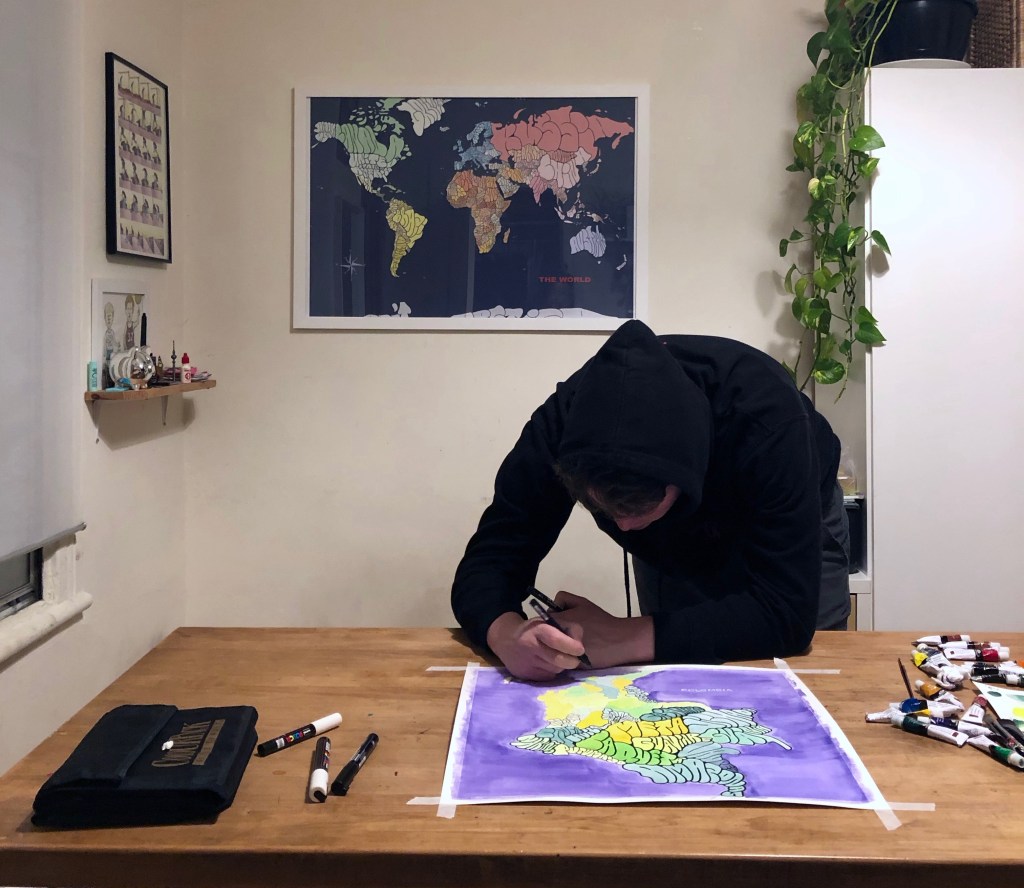
On the 6th of November I sat down with Charles LeMoyne, creator of Island Maps, an ongoing series of graffiti-esque interpretations of country, city and state maps illustrated in the confines of a border’s boundaries. We spoke about his artistic process, content and the battle of digital vs analog over a couple cans of Sapporo at Park Lafontaine.
N.810 – How did you start this project of drawing maps?
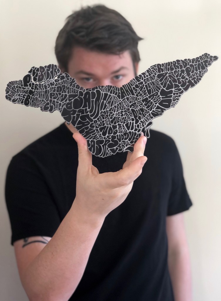
Charles LeMoyne – I drew a map of the U.S. and saw the shapes of the states. It clicked to do bubble letters in the boundaries of the borders, that was the first one I did. It wasn’t very good, but the idea started with that because every shape was different yet recognizable on its own. You can identify the shape of Texas on a map, so it was more of a challenge to see if I could make something legible of a cut-out shape. What’s cool about the bubble letters is that you don’t have any negative space, so you’re really forcing the letters into that shape.
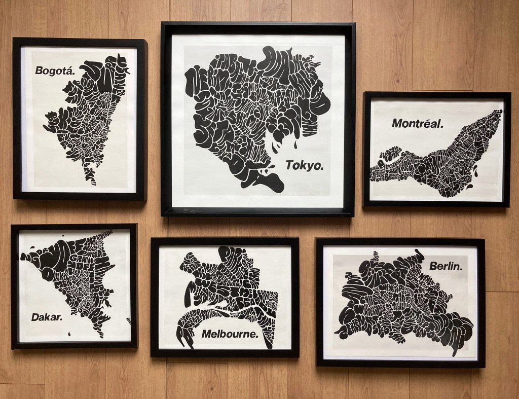
Now I look at that first drawing and think, What the hell was I thinking? I used a marker that bled into the page so you can barely read it. But I posted it on Facebook and that was the first photo of mine that ever got over a hundred likes or something. That gave me a little boost; maybe people who don’t necessarily have this weird obsession with graffiti will still be able to appreciate it. So, I did the Montreal one and took it from there. Had to do one for my hometown.
N.810 – What’s the process for selecting a location to draw?
C.L. – Initially I needed to do things that were identifiable, otherwise there wasn’t a point. I started with Montreal since it has that island shape everyone from here knows. I got stuck on the idea of only doing islands. For some reason I didn’t think it was worth it to do anything that wasn’t identifiable as a shape in itself. Then I started to venture out; I guess I got bored of doing the one drawing and thought, why not try some other ones? People can recognize the shape of Canada, and most other countries it turns out. But it started with Montreal because I felt like most of my friends would see it and appreciate it.
N.810 – Why use this process on maps and not something else?
C.L. – There’s something about taking a shape that’s seemingly random, that looks very abstract on its own. As soon as you fill it in on the page, it turns into something identifiable. It’s kind of a beautiful blend of abstract and familiarity. There’s a process of discovery. It’s intriguing in that way where you’re not too sure what it is at first, but you take a little step closer, and you can start to make it out. It’s not just the immediate reaction to it, it’s not one moment, you can take a bit of time to figure out what it is and I think that’s what’s fun about it.
N.810 – When did you start to take this project more seriously?
C.L. – It was a bit of a transition taking something I’d been doing purely for fun just on paper and finding a way to turn it into something I could reproduce. The hardest part was transitioning from drawing something that exists on its own into something done on the computer that can be reproduced. It was hard to convince myself that had the same artistic value as something that happens spontaneously. I was reluctant, but when I saw the product it gave, it inspired me to try different techniques.
N.810 – What’s been your experience working digitally compared to working with a pen and paper?
C.L. – I’m definitely more comfortable working with pen and paper. I think that’s true for a lot of people, but there’s a way to balance both. I find that doing maps on paper every once in a while keeps me motivated. It helps me understand what inspired me to do this in the first place. Digitizing the work is very enjoyable. I love doing it; it’s just different. You don’t get the same feeling as working with paint or markers. There’s something really satisfying about taking what you’ve done on paper and turning it into a really crisp computer file. The lines, the way everything is cut clean, you can reproduce something that has the same value as what you created in the first place. I’m still trying to find a perfect balance between the two; there’s just more you can do with something when it’s digitized.
I definitely have an appreciation of doing the hand-drawn stuff though. I could never do everything on the computer. I’d never feel fulfilled, I need my dose of hand-drawn maps. Having my designs done on the computer moves my project forward and gives me room to grow. I didn’t expect it to look good, I was worried it would look fake when I did my first one on the computer, but they’ve retained that funky letter structure.
N.810 – Are there any glaring differences between digital and paper?
C.L. – Drawing on a tablet is different with the ability to do a step back, undo your mistakes when you make them. I don’t know if that’s good or bad, but I’m so accustomed to drawing a line and hitting undo that I end up being a perfectionist with my work on the computer. There’s more of an organic flow to the process when you’re working on paper and everything’s final. The stuff I do, you get one go at the outline and that’s what you get. It’s cool because you end up with funky lines that you have to work with. But there’s something satisfying about having a product that you can deliver consistently. I’m able to do that with the tablet and working on the computer.
N.810 – Where did the bubble letter style come from?
C.L. – This whole project comes from being addicted to graffiti back in the day. While I’m not trying to make this project about graffiti because it’s not linked to vandalism in any way, I see it as channeling that obsessive graffiti part of myself and finding an outlet that doesn’t involve getting arrested. That’s where it comes from, finding a way to keep my connection to graffiti in terms of my artistic inspiration, and channel it into something that represents me.
You can follow Charles @
SHOP: islandmaps.bigcartel.com